The color of your home’s siding contributes significantly to its curb appeal. The siding color alone can make a home appear classic, crisp, and fresh, traditional, refined, laid-back, and modern, unoriginal, and generic, or dated and drab. Choosing a color is a good first step when getting a siding installation.
This is a decision you want to get right when renovating your home. If you have an upcoming siding project, take a moment to review these color selection guidelines.
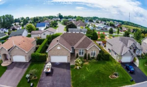
Popular Siding Installation Colors in Nebraska and Iowa
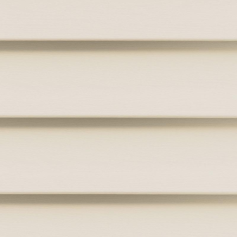
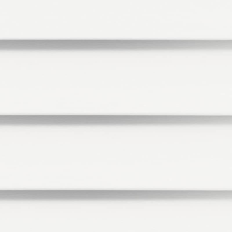
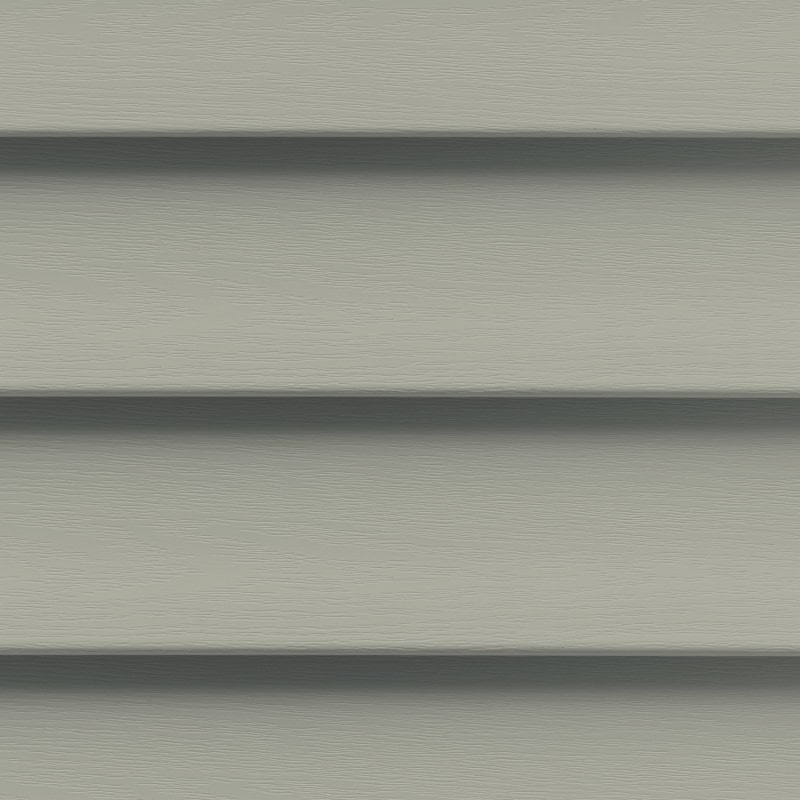
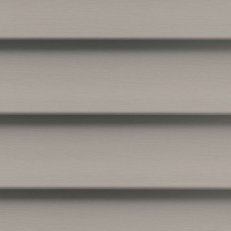
White, beige, cream, and light gray appear to be the most common light and neutral siding hues. Following that are shades of darker gray, blue, green, earth tones, red, and yellow.
A neutral shade of cream may feel like the safest option, but any color is acceptable for siding.
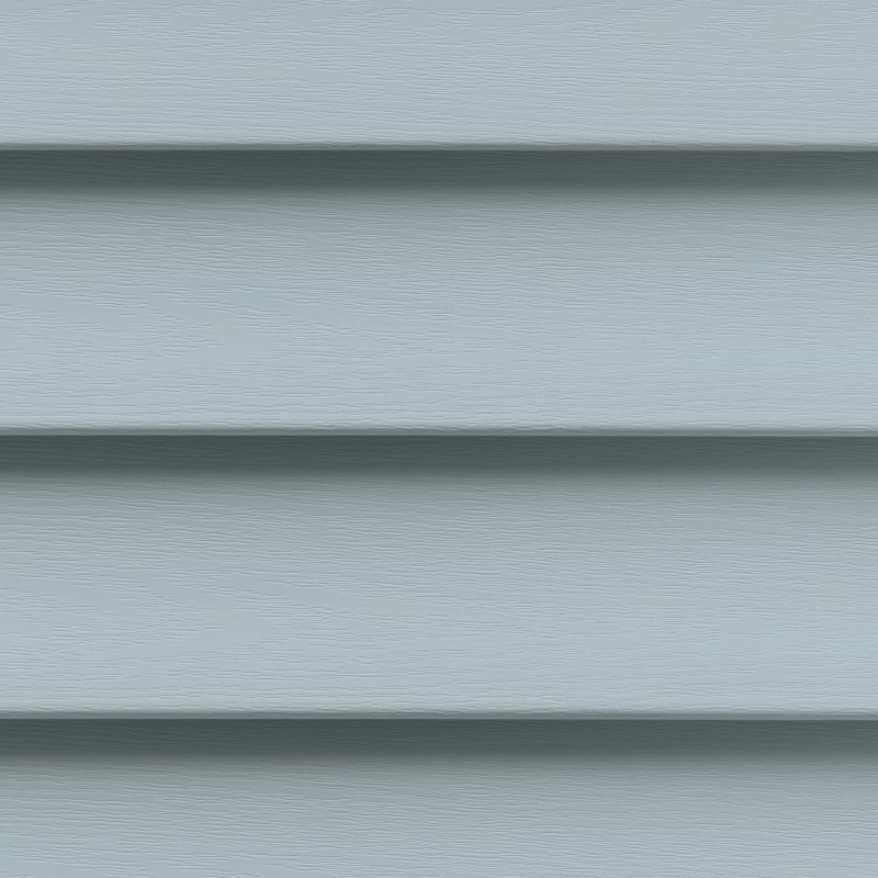
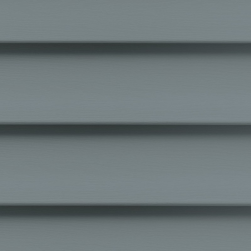
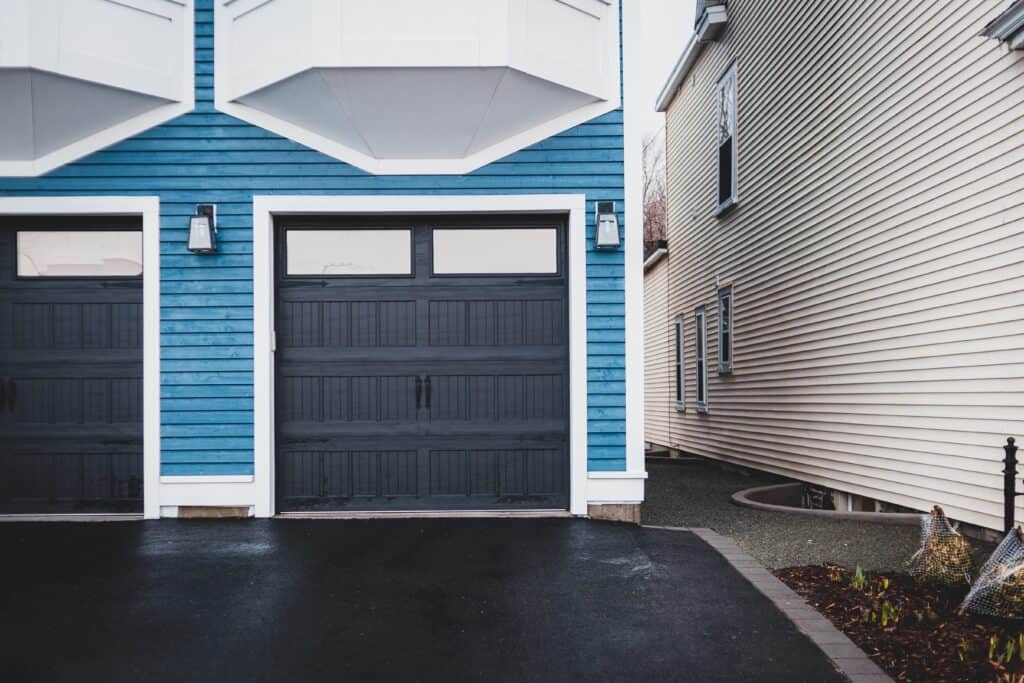
All shades of blue are incredibly fashionable, with siding available in hues ranging from light baby blues and coastal blues to deep executive-worthy indigo and navy blue.
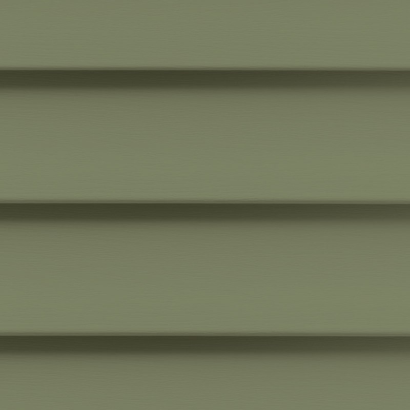
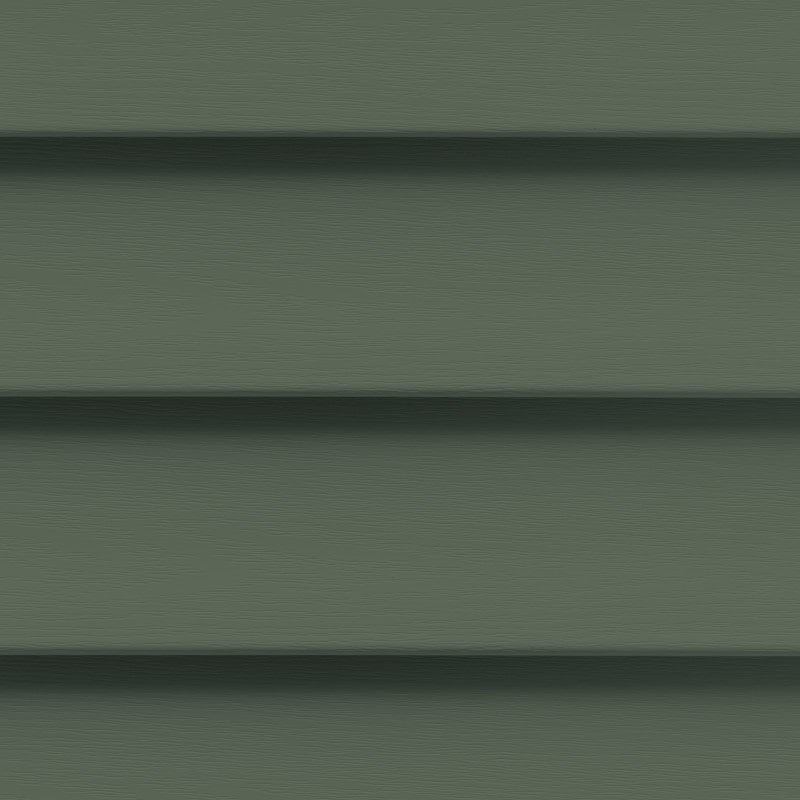
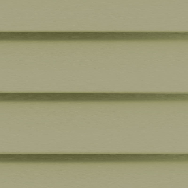
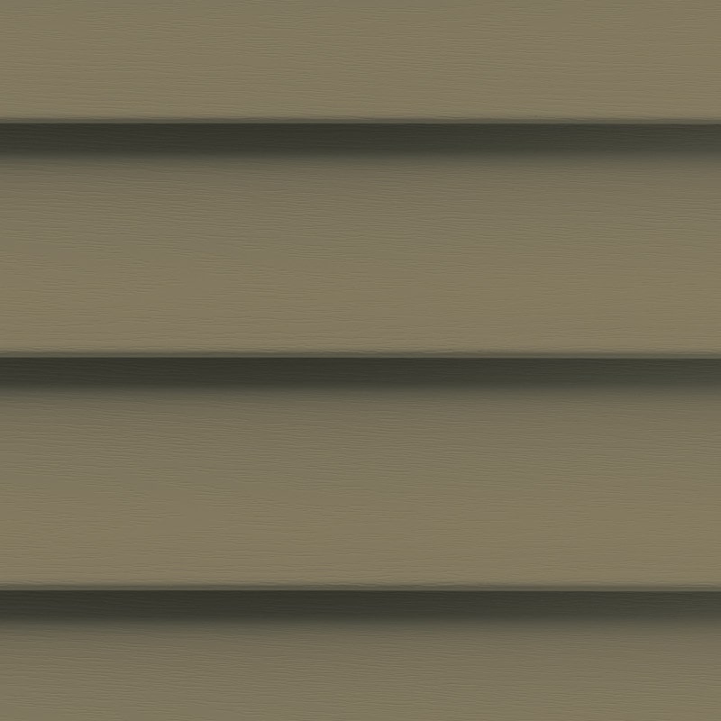
Sophisticated options include muted sage greens with a lighter hue, olive greens with a medium hue, and forest greens with a deep hue.
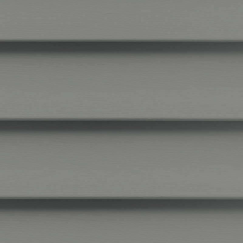
Gray hues are typically perceived as sophisticated, elegant, calming, and mature. All earth tones are calming, grounded, and relaxing.
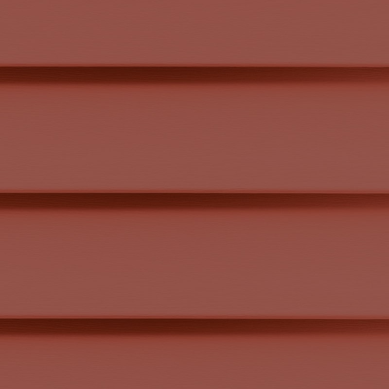
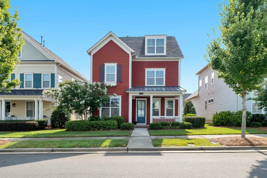
Red is surprisingly adaptable and can be used in rural, suburban, and urban settings. Deep robust reds appear contemporary, whereas deep muted reds have a rustic allure — without appearing like a barn.
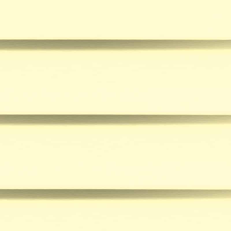
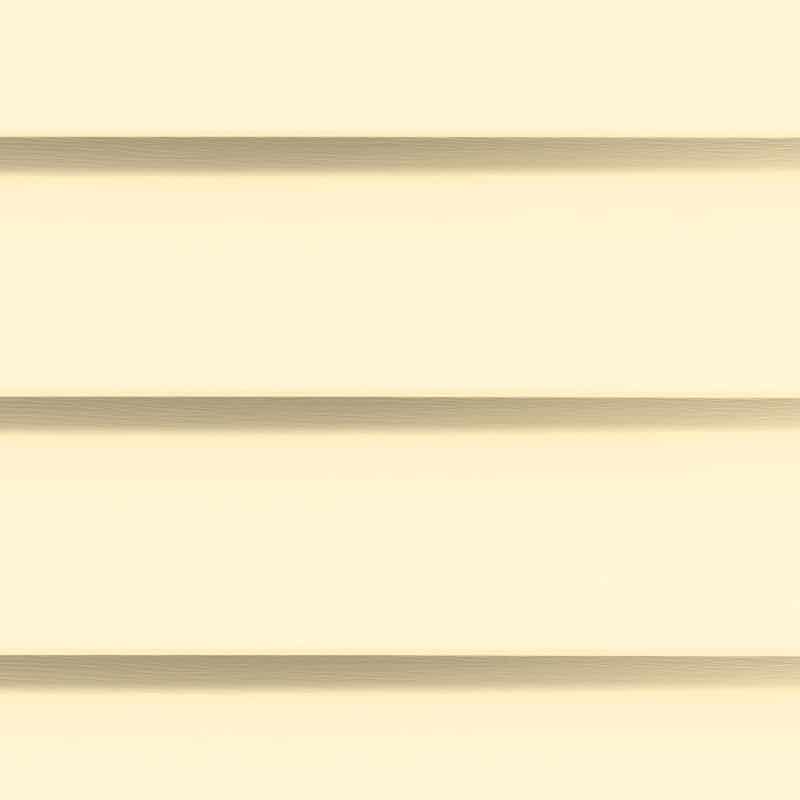
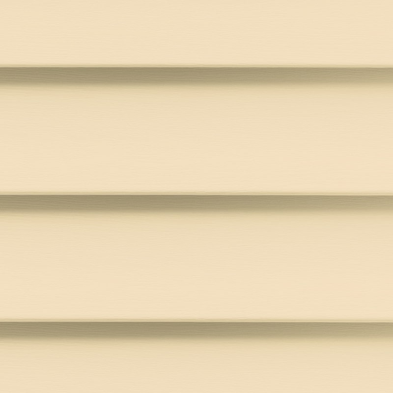
Yellow exudes charm and freshness when it is on the paler side, energy when it is bright, and coziness when it has a hint of mustard.
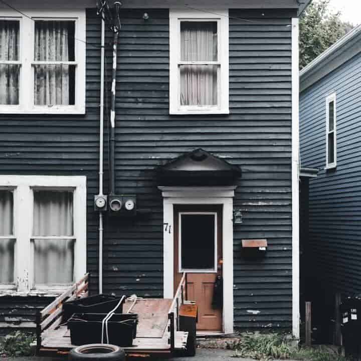
When used correctly, darker slates, midnight blues, and black convey upscale taste and a refined aesthetic.
Siding Colors for Various Architectural Styles
Craftsman design complements robust and robust earth tones. Consider olive green, saturated brown, and bold, rustic red.
The Victorian style complements pastels and lighter hues well.
Tuscan architecture combines warm hues with cooler stones.
Low Country architecture is characterized by the use of whites, blues, and sage that are light and airy.
Warm terracotta roofs are balanced by orange and peach-colored siding on Mediterranean-style homes.
French Country homes are adaptable and upscale, so natural neutrals with hints of muted blue, green, or yellow should be used.
Modern homes feature steels, slates, grays, and blues that are sophisticated.
Developing an Exterior Color Scheme
The majority of homes have multiple exterior colors. The roof, siding, window frames, doors, garage door, and other elements may be different hues, but they must still have a unified appearance.
Because of this, you should not choose a siding color without considering the colors of your roof, exterior trim, exterior stone, brick, or wood, as well as other outdoor elements such as a stone driveway.
Color palettes are excellent tools for identifying complementary color combinations.
- One color dominates a three-color palette, while the other two serve as complements. This works exceptionally well for a three-color exterior in which the siding, roof, and trim all feature distinct hues.
- First color: dominant primary color used on most or all siding.
- Second color: found on the roof, exterior stone or brick sections, or a smaller portion of the siding.
- Third color: found on window and door trim or other accenting elements.
- A four-color palette consists of one dominant hue, two complementary hues, and an accent hue. This would look good on a house with different-colored siding, roof, driveway, and trim.
Here’s a little more about color palette options.
Selecting and Employing Colors for your home’s exterior
Looking for colors for your siding and gutters that will complement your roof? Or stuck trying to find the perfect shade of cream to illuminate your roof, driveway, and accent brick wall?
You can use color schemes to find colors that complement one another and produce the desired visual impact.
However, before we discuss those, here is an overview of how colors are described and utilized. Understanding these terms can help you determine why a color is or isn’t what you’re looking for and make it easier to find the one you need.
Hues A hue is the conventional term for a color. Colors include orange, red, pink, blue, and green.
- Tints
A tint is a color or hue to which white has been added to lighten it. Powder blue, baby blue, and pastel blue are all shades of blue with a whiter hue.
- Shades
A shade is a color to which black has been added to darken it. Both navy blue and dark blue are shades of blue.
- Tone
A tone is a color that has been modified by the addition of gray. Slate blue and steel blue are blues with gray undertones.
- Saturation
Chroma is the strength, purity, intensity, or saturation of a color. It can be thought of as the “colorfulness” of a color. For instance, pastel yellow is less vibrant than mustard yellow. Eggshell blue is less colorful than teal blue, which is more vibrant.
High chroma colors are intense and vivid.
Six color palettes to consider for the siding installation
- Monochromatic
A monochromatic color scheme employs various tints, shades, and tones of the same hue. You can have as many variations as you like, but it is probably best to limit yourself to three or four colors.
Monochromatic color schemes are straightforward, unified, and easy on the eyes.
- Analogous
Analogous color schemes consist of three adjacent colors on the color wheel. One is dominant, the second provides support, and the third provides emphasis.
These schemes can utilize colors with the same chroma level or dial down certain colors to highlight a dominant color.
- Complementary
Complementary color schemes consist of two hues from opposite sides of the color wheel. This image has a high contrast that can be altered by adjusting the color intensities.
- Clashing
A split complementary palette is comprised of one dominant hue and two adjacent colors.
- Triadic
A triadic palette consists of three colors evenly dispersed around the color wheel. (For instance, shades of blue, red, and yellow.)
- Fourfold or Double Complement
A tetradic palette consists of four colors evenly distributed across the color wheel.
Finding a Siding Color to Complement Existing Exterior Elements
Unless you’re redoing the entire exterior of your home, your new siding will likely need to complement the existing hues.
Here are some suggestions for coordinating these elements.
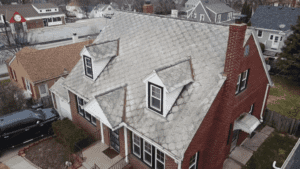
Roof
It is a good idea to use lighter siding that is either the same color as the roof or a contrasting color if the roof is dark.
Black roofs complement stark white, gray, and pastel colors.
Gray roofs complement slate grays, light grays, off-white, and blues or greens with gray undertones.
Brown roofs complement earth tones and more pronounced grays.
Green roofs complement hues of white, cream, gray, earth, and blue.
Downspouts, Eavestroughs, and Gutters
Consider the gutter system a distinguishing characteristic.
Doors and Windows
Doors and window treatments can be considered an accent.
Exterior Brick Work
Collect the colors from the brick, and then add them to your color palette. You may wish to match the mutedness or saturation of the brick.
How to Determine the Ideal Siding Color for your siding installation
Determine the number of siding colors you need to find or match. Then, you can either choose an existing color to design around or choose the siding’s color. After selecting a color, select the desired tint, shade, tone, or intensity. Then, use a color scheme tool to create a siding palette that is aesthetically pleasing.